Going Down the Rabbit Hole - A Historical Look at AWS Pricing
When a coworker asked me if AWS had a historical pricing sheet, I was astounded to find out the answer was no. I went digging into the AWS landscape to find the answers and here is what I found. AWS has publicly reduced its pricing across various services 62 or 65 times depending on who you ask or what metric you utilize. With these changes it becomes hard to understand historical pricing trends for AWS other than they make it cheaper as their internal modeling allows.
Selecting the Target
I decided to deep dive on this topic with the one service which has the longest pricing history and the most consistent formats, S3. For those of you who have never looked or might have forgotten, S3 was one of the first three offerings out of the AWS team with EC2 and SQS being the other two. While the SQS service is the eldest, it hasn’t seen many price reductions in its lifetime. Part of this is due to that its a managed offering but more likely this is due to the fact that its not really tied to economies of scale. The next logical place to look naturally would be EC2. EC2 has a long history of price reductions; however, they are hard to track with the constant enhancements of the instance families. Older instance types are hardly ever destroyed but their prices are usurped by the newer generations. As expected, this is where AWS is showing their scale and purchasing power but it creates unnatural plateaus and drops within a long term view of the service pricing. So that leaves the investigation to the “youngest” of the three elder’s children, S3.
Testing Methodology
In selecting S3, we get several benefits to our analysis:
- a singular class of storage since inception providing clear pricing since 2006
- a view of the AWS purchasing power compared against trackable consumables such as drive capacity
- a trend which demonstrates how AWS treats smaller consumers versus the largest consumers of a service over time
Looking at all the price reductions, I normalized all the data from 2006 through the last reduction in March 2014. To do this I have to look at the current S3 Tiers and apply them retroactively to the pricing from the past which provided the pricing regardless of the tiers in use at the time. This was surprisingly time consuming as some were written as “0-50TB” while others were additive in nature “next 100 TB”.
Historical Pricing
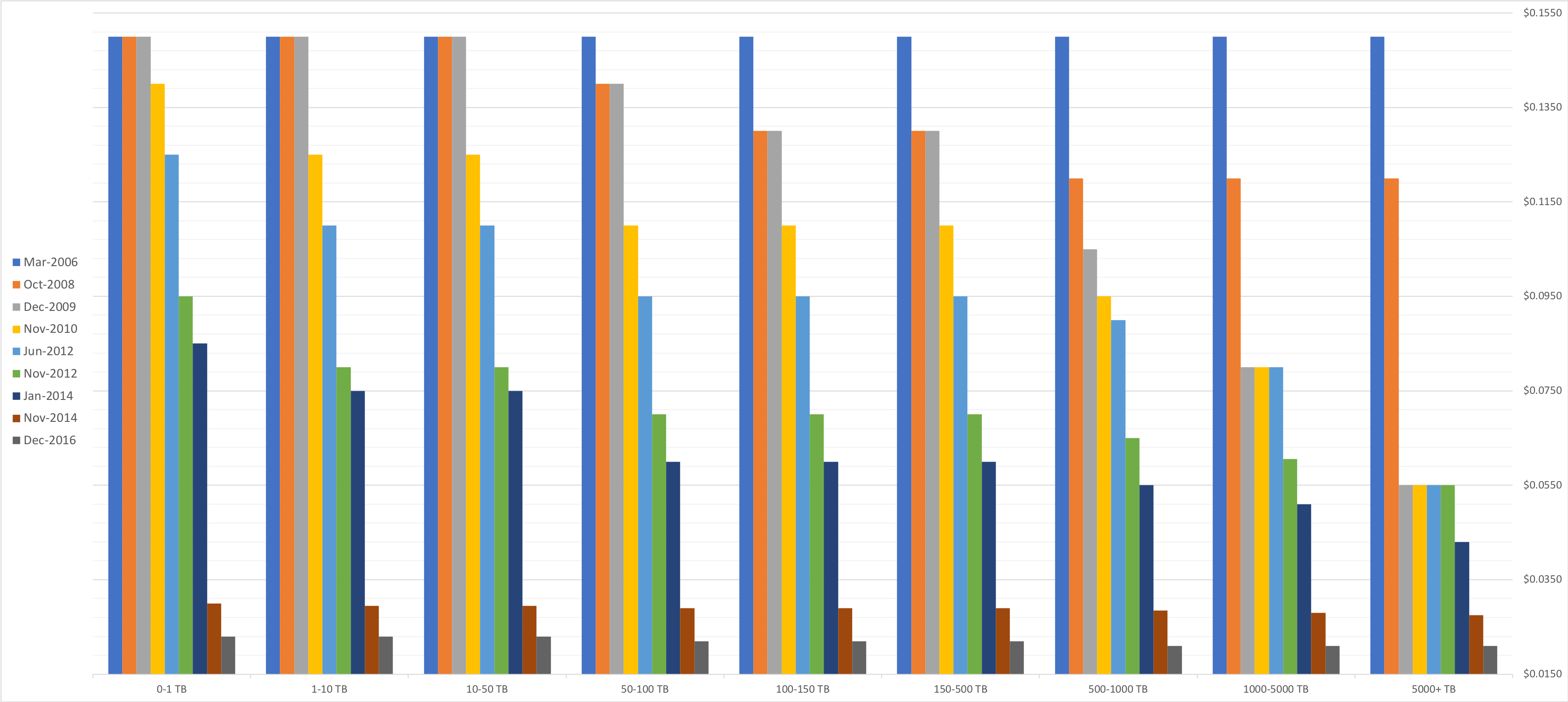
In the graph below, you can see this normalized data. The tiers are arranged smallest to largest and the chart also ages oldest to newest in the bar chart groupings.
 Click to expand
What I see in that data is that AWS …
- has never increased prices, but has not always made it cheaper
- decreases costs in specific set of tiers (e.g. mid volume or high volume) most of the time
- drove down their internal costs in 2008, 2012, and 2014 to provide the highest discounts
Purchasing Power
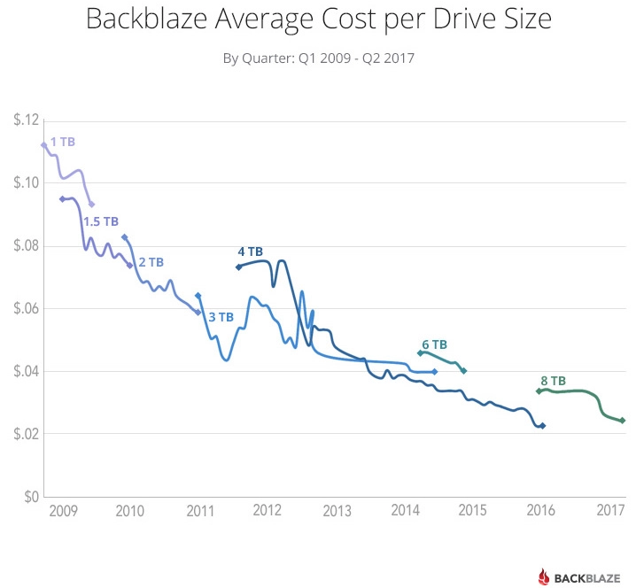
What surprises me in those charts is actually how steady prices are at the higher volume tiers. As a result, I went looking for a historical price record and found one at Backblaze. I want to thank Backblaze for letting use this image. I find this a particularly interesting graph because these are prices reflected at a volume scale. These are more representative of what AWS would pay than what I would pay at my local retailer.
 Click to expand
The chart depicted does not start in 2008, but I would venture to say that the savings in 2008 are more of an architectural update because the prices do not drastically fall as the usage increases. When we start looking at 2012 and 2014, things get more interesting. In 2012, 4TB drives premiered around $0.08/GB which was how much 2TB cost in 2010; however, even more telling was the drastic price decrease in the 3TB drives. As a result of these supply change price decreases, we see a nearly 40% drop in in storage over 50TB compared to their 2010 pricing.
Volume Customers
To see how AWS treats volume customers, I think its important to look at the tiers which they supply. If we look at the this table, we can see where AWS has decided to reward/penalize customers to storing too little over time or too much too early on.
| Tier | 2006 | 2008 | 2009 | 2010 | 2012 | 2014 | 2016 |
|---|---|---|---|---|---|---|---|
| None | X | ||||||
| 0-1 TB | N | X | X | X | |||
| 0-50 TB | N | X | |||||
| 1 - 50 TB | N | X | X | X | |||
| 50-100 TB | N | X | X | ||||
| 100-500 TB | N | X | X | ||||
| 50 - 500 TB | X | X | X | ||||
| 500 - 1000 TB | N | X | X | X | X | ||
| 1000-5000 TB | N | X | X | X | X |
Legend: N = Newly Added, X = Pre-existing & carried forward
What you can see in this data is clearly AWS rewards or more correctly, incentives, Data Gravity. In 2009 they cut the prices for the top 3 buckets while leaving the rest the same. In the next two increases they dropped their prices for the middle, and again in 2014 and 2016 they drastically cut prices on the higher end. Additionally, over time, they increases the “width” of the middle buckets as well. All this indicates that AWS wants to host all of your data which they use as a method to move their users into other services beyond pure storage, surprising no one.
Conclusion
I hope this sheds some light on how AWS, or any cloud provider for that matter, is reevaluating their internal costs and adjusting to provide the best value to their users. If you would like the raw data, please do not hesitate to reach out to me.